Samsung Electronics · May 2025 – Present
Making Product Comparison Actually Work on Samsung.com
Samsung.com's Product Finder helps U.S. shoppers filter and compare products. I led a research-driven redesign of the comparison experience in partnership with product, data, and engineering.
- Timeline
- May 2025 – Present
- My role
- UX Design
- Research & Strategy
- Cross-functional Collaboration
- Team
- Design, Product, Data, Engineering & Business
- Tools
- Figma & Sketch
- UserTesting.com
- Confluence & Jira
The problem
Shoppers struggled to compare products confidently. The experience was visually dense, specification data was often incomplete, and users rarely reached the information needed to distinguish one product from another.
How we found the problem
Two evidence sources revealed the same pattern
Customer feedback and a structured UX audit both pointed to an experience that was difficult to scan, navigate, and trust.
01 — Net Promoter Score (NPS) feedback
NPS comments repeatedly described the comparison experience as confusing, difficult to scan, and incomplete.
“Challenging to try and look between several products to compare.”
“Confusing site, hard to compare items.”
“Specs are hard to access and compatibility information is not clear.”
10%
Average scroll depth in the comparison modal, suggesting that few users reached deeper specifications.
~100
Users included in the analysis of comparison behavior on Samsung.com.
02 — UX audit
A structured audit revealed usability issues consistent with the frustrations described in NPS feedback.
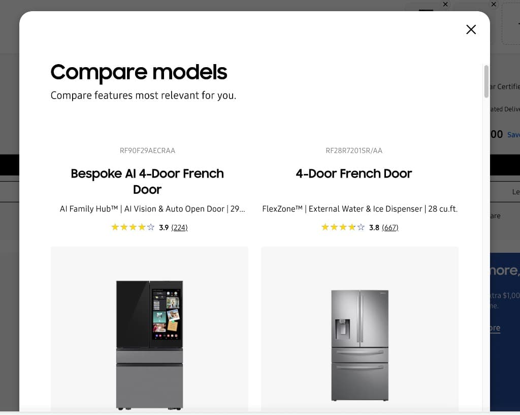
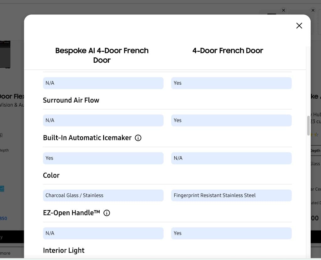
Competitive research
Competitor patterns revealed a clear opportunity for Samsung
I evaluated Samsung, Home Depot, Best Buy, and Lowe's against six criteria tied to comparison clarity, scannability, and purchase confidence.
Key takeaway
Home Depot and Best Buy met five of the six criteria, while Samsung met none in the audited experience. The gap was structural, not cosmetic, showing a need to rethink how specifications were organized, prioritized, and compared.
| Criteria | Home Depot | Best Buy | Lowe's | Samsung |
|---|---|---|---|---|
| Categorization of specifications | ||||
| Five key specifications at a glance | ||||
| Key differences highlighted | ||||
| Visual layout and alignment | ||||
| Scannability | ||||
| Responsive layout | ||||
| Score | 5 / 6 | 5 / 6 | 2 / 6 | 0 / 6 |
Strong overall; responsive layout was the only criterion not met.
Strong overall; scannability was the only criterion not met.
Met categorization and key-specification criteria, but missed the remaining four.
The audited experience did not meet any of the six comparison criteria.
Defining the direction
One question focused the redesign
The research pointed to an information problem, not simply a visual one. I used a single how-might-we question to align the team around the decision shoppers needed to make.
That question translated the research into four design goals: improve scannability, surface key specifications, highlight meaningful differences, and organize specifications into clear categories.
How might we
How might we help shoppers compare the specifications that matter most without forcing them to scan an overwhelming table?
Information architecture
Organizing specifications around how people choose
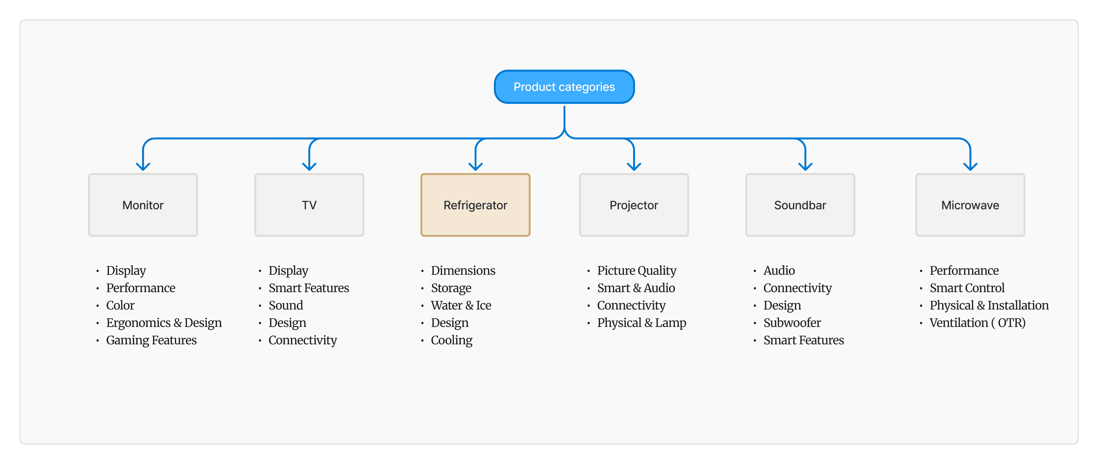
I reviewed RTINGS.com, Best Buy, Reddit, Consumer Reports, and buyer guides to understand which details shoppers prioritize across appliances and electronics. Those signals helped identify the decision-critical specifications for each product category.
For refrigerators, that included dimensions, storage, water and ice, design, and cooling. I then mapped category-specific groups across product lines so shoppers could move directly to what mattered without every product being forced into the same hierarchy.
Refrigerator
- Dimensions
- Storage
- Water & Ice
- Design
- Cooling
Microwave
- Performance
- Smart controls
- Physical & install
- Ventilation
TV
- Display
- Smart features
- Sound
- Design
- Connectivity
Soundbar
- Audio
- Connectivity
- Design
- Subwoofer
- Smart features
Projector
- Picture quality
- Smart & audio
- Connectivity
- Physical & lamp
Monitor
- Display performance
- Color & picture
- Connectivity
- Ergonomics
- Gaming
Design iterations
Each round removed a different source of friction
I worked with design and product partners to test feasibility and refine the model across several iterations. Rather than showing every screen, these two stages capture the decisions that materially changed the direction.
Structure improved, but scrolling remained
The first concept introduced key specifications and main and subcategories. It created hierarchy, but shoppers still had to move through a long comparison page.
Faster scanning added more interaction
A category-jump menu shortened the path to deeper specifications, but it introduced extra clicks and relied on shoppers knowing where to go.
Final direction
A comparison experience built around decisions, not data volume
The final direction combined the strongest ideas from earlier rounds and addressed the four needs identified at the start of the project.
After four to five rounds of feedback with design and product partners, the final concept was aligned and shared with the mobile team for implementation review.
Explain product fit
Help shoppers understand why a product may suit their needs before they enter the specification table.
Create a clear hierarchy
Use main and subcategories so shoppers can move directly to the information they care about.
Prioritize key specifications
Surface decision-critical details early instead of treating every specification with equal importance.
Make differences scannable
Help shoppers identify meaningful distinctions without reading the full table row by row.